Genregraph weird representation
The bargraph that shows your top genres is sorted by the minutes listened, but the length of the bar is set by the amount of streams causing wonky looking graphs:
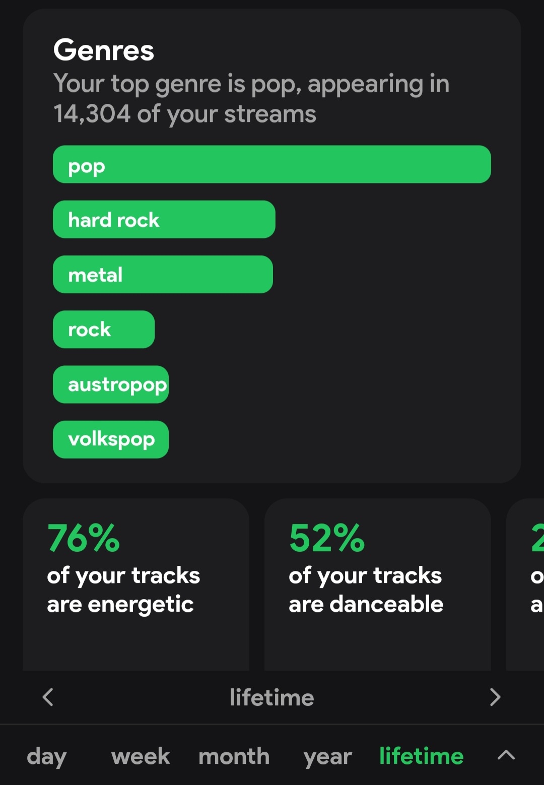
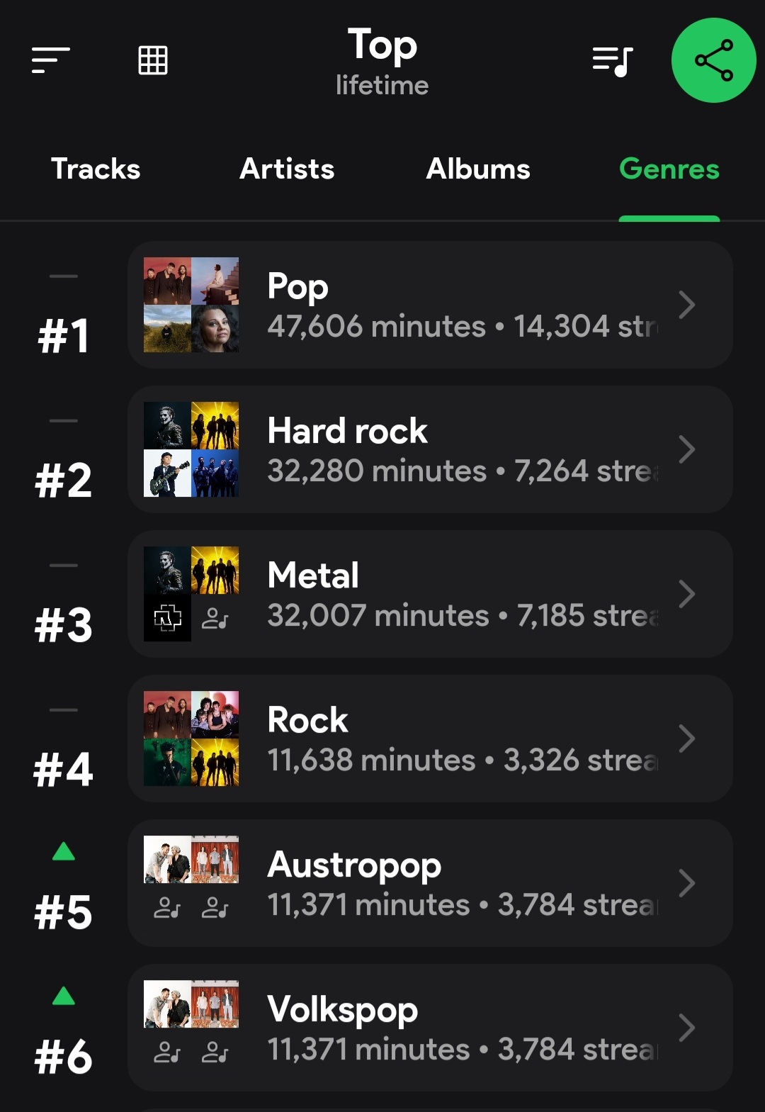
The bargraph that shows your top genres is sorted by the minutes listened, but the length of the bar is set by the amount of streams causing wonky looking graphs:
Log in to comment and vote
No comments yet
Be the first to share your thoughts.