UI Redesign - Profile

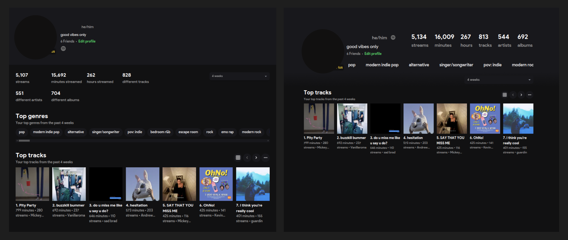
  • Stats - Seems redundant to include 'streams' and 'different' when that can be inferred from the stat.

  • Top Genre Chips - Shifted into profile header section and removed section title/description. I believe these can be inferred from context.

    • on hover: display mac like scroll bar

    • overflow / Chip 'falling off' screen helps indicate to the user section has horizontal scrolling.

  • introduced gradient instead of hard line between header and body

    image

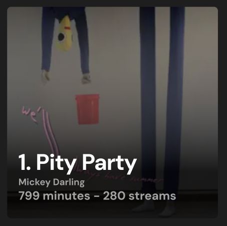
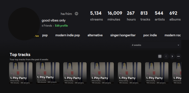
Tweaks to the Top Tracks carousel item, this would apply to tracks and albums.

  • Deprioritize artist and stack meta on image

    • I believe a user viewing this data will be intune with their music enough to know the artists of their top tracks. They can still quickly access that information if needed.

      image
image
image


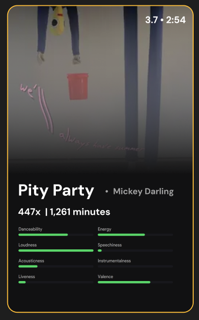
On hover: modal display of song or album preview

  • Border color by rank on leaderboard (1st, 2nd, 3rd), after that nothing... or green

  • Audio Features in card could be swapped, or have three to four pages

    • Page 1 Vibe chart

    • Page 2 Musical information (loudness, key, mode)

    • Page 3 Vibe Chart

    • Page 4 Recent streams

Page 1/3 could be next to each other, OR consolidate the pages and have user click swap between the two chart types.. I am also not set on the order, users may want recent streams first.

2 comments

Log in to comment and vote

Comments2

  • Rorty

    •

    Dec 19, 2024

    I may be biased but I think this looks great

    • Rorty

      •

      Dec 19, 2024

      Something to note - Per spotify you cannot cover media provided by their API