The new monthly recap layout
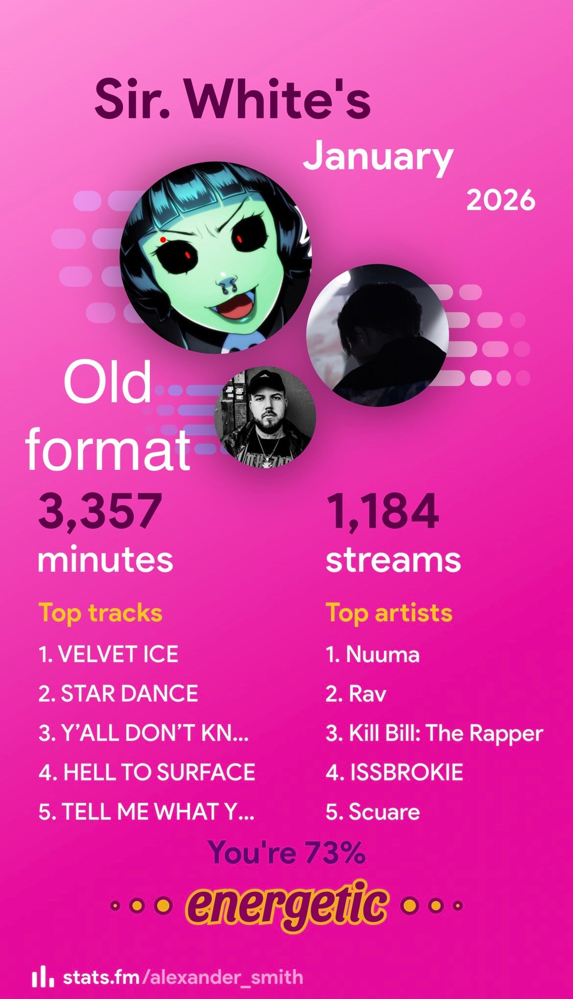
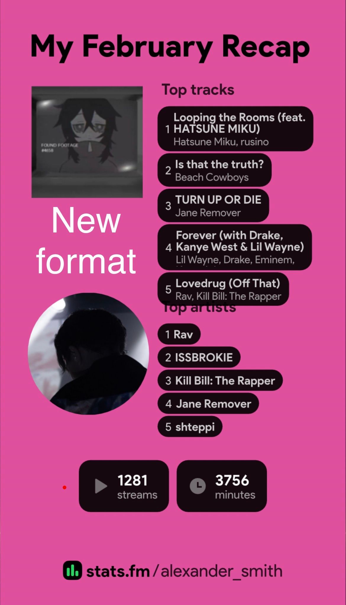
To put it bluntly, its bad, really bad. I was going to get my monthly recap from stats for my monthly instagram post as I usually do and was hit with a super high production overdone effects recap. I brushed it off thinking it was just the initial animation, but the entire layout of the monthly recap images I can save was changed. Instead of being a nice side by side it is stacked on top of eachother with harsh black boxes around the songs section. Not to mention the fact that these black boxes literally overlap with the other text on the recap image and cover some of it. The black box for the bottom song on my monthly recap covers up the text saying “top artists” making the entire layout look really trashy and bad aesthetically. Either completely change it back or give the option to just use the okd format, because as it is, it looks really bad and I will be using a different service to get my monthly recap of listening.
Please authenticate to join the conversation.
Open
Feature Request 💡
5 months ago

Sir. White
Subscribe to post
Get notified by email when there are changes.
Open
Feature Request 💡
5 months ago
Sir. White
Subscribe to post
Get notified by email when there are changes.